What you get
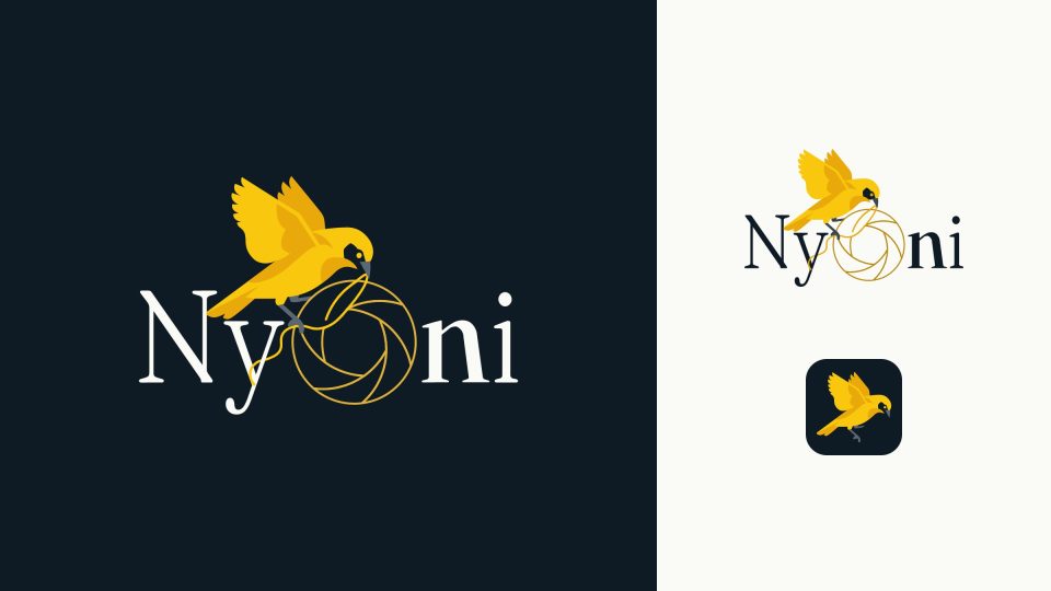
A mark that works at every size, from a favicon to the side of a vehicle, in full colour and in one colour. Then the system around it, so that whoever designs your next poster or presentation has clear rules to follow, and your organisation looks consistent without anyone policing it.
Every identity is delivered as a properly organised kit: vector files for print, web-ready files, versions for dark and light backgrounds, a small mark for social avatars and app icons, and guidelines that explain how to use it all in plain language.
How it runs
- Listen. A questionnaire and a workshop (in person or online) about who you are, who you serve, and how you want to be seen. For organisations with an existing brand, we audit what you have first.
- Directions. Two or three distinct design directions, each shown on real applications, not just a logo floating on a white page.
- Refine. We develop the chosen direction through the agreed rounds of feedback.
- Systemise. Colour, type, layout and usage rules, then the guidelines and the file kit.
Refreshing an existing logo
Sometimes the logo is fine and the problem is everything around it: low-resolution files, colours that change from print to print, no rules. A refresh keeps what people already recognise and fixes the rest. Ask about it in your message.